Morning all. Yesterday I started you off with a few tips to get you motivated to scrap. Today I am going to talk about composition. Now I am no artist or graphic designer, but I think I know what looks good on a layout and what maybe could look better. Not every layout I do is anywhere near perfect, and sometimes you have to have the courage to stop, walk away from your project for 20 minutes or more and then return and either start again or look at the layout with a fresh pair of eyes and remove, add or move elements.
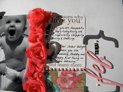
Today's layout is a case in point. It started off very differently, but I think this was the best I could do. I love using plain cardstock as a base for my layouts as sometimes I find that a busy patterned paper just throws me and my layout idea due to its busyness. A way around this is to literally start with a blank canvas. I chose a piece of the lovely Songbird paper from Prima. I tried several ideas for layouts on the beautiful paper on the other side, but in the end I plumped for the grey plain side. This meant that I was in control of the layout, not the paper. Here is the layout
You can see that I have chosen to position the photo to the left and then added paper elements that are the same width and length. The symmetrical appearance is pleasing to the eye. I have added a shocking pink ruffle ribbon in the centre to draw the eye's attention to both the photo and the journalling. I have added some Prima paper to the bottom which contains some more pink to tie the elements together. You will see that I have used pink fabric Thickers to correspond to the other pink elements on the page. I have punched a small butterfly to add to the top corner of the photo and added a pearl which relates to the pearl border underneath the journalling. You will also notice the pearls around the date. All of these similar elements tie the layout together and lead your eye from the top left to the middle and then the top right. This is how we read and why I think this composition works.
I thought I would recap on the tips I have given you so far about how to motivate you to scrap successfully and enjoy it once again:
1. Try using black and white or sepia toned photos.
2. Try to compose your layouts in a symmetrical way as this is simple technique to start with and pleasing to the eye. Have a look at this other layout I did to see what I mean.
3. If you are using a colour photo, pick out one or two of the colours and use those to help you choose your patterned papers and embellishments.
4. Try using plain cardstock as a base rather than patterned paper - that way you can control the layout. Kraft, black, white, cream and grey are great bases.
5. Use the same or similar accents across your layouts in order to tie all of the elements together.
You can get the vast majority of the papers and embellishments that I use from Gotta Craft. Here is the sketch that I had in my mind when trying to create the layout today.
I would love to hear what you think about any of the tips I have given so far or anything you may be struggling with that I or the DT be able to help you with. Back tomorrow with another layout that will help with colour choices and adding dimensional elements.


1 comment:
i agree with your comments about busy paper throwing you off course sometimes - but it doesn't stop me trying :-) that courage to walk away (or even to scrap the scrap - now that's difficult) is essential. also composition - i'm looking for a design book at the moment that will teach the ins and outs of visual design (like we learned in Art at school). i know the rule of thirds is really important and always try to work to this. another great post! x
Post a Comment